
Nothing touches. Everything moves.
Platforms: PlayStation, Xbox, Windows and Mac
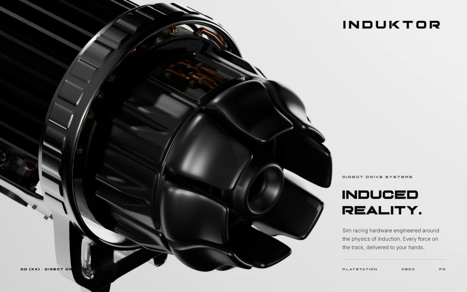
Induktor makes sim racing hardware engineered around the physics of induction: direct drive wheelbases for PlayStation, Xbox, PC and Mac that put every force on the track into the driver’s hands — without loss.
“Induced reality — every force on the track, delivered to your hands.”
A whole brand, in ten days.
From the first brief to the complete brand in 10 days — strategy, symbol and logotype, typography, materials, imagery, motion, the campaign frame and the digital experience. The studio’s fastest project yet.
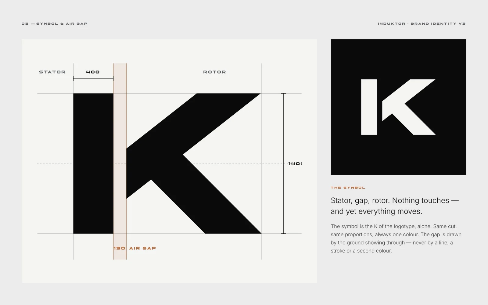
Stator, gap, rotor.
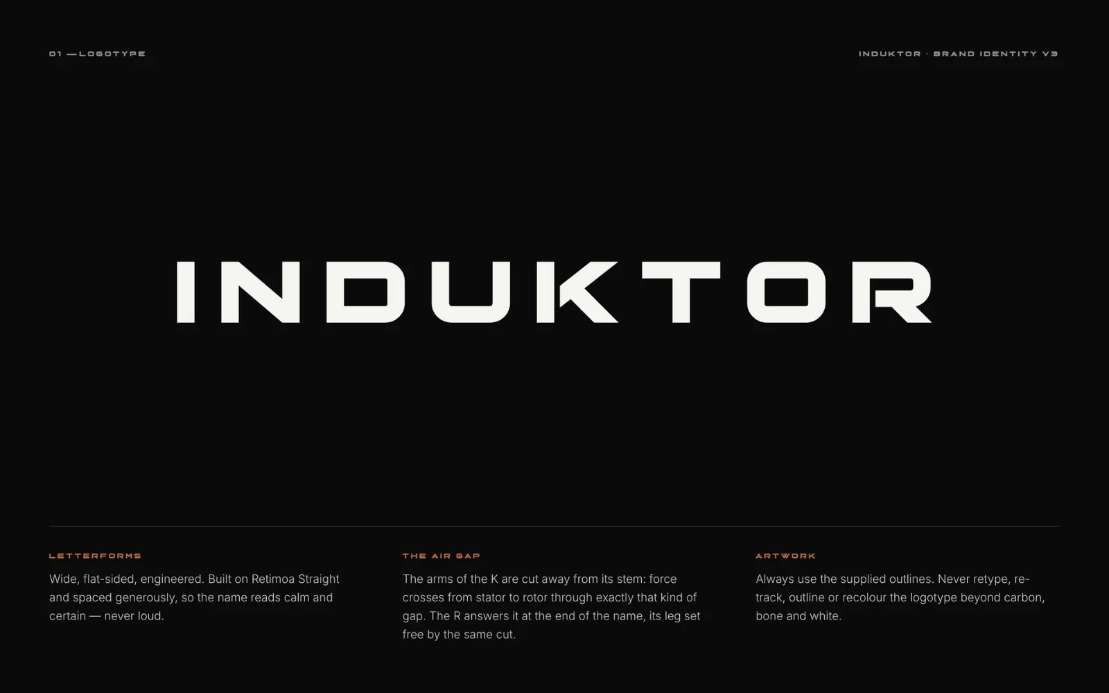
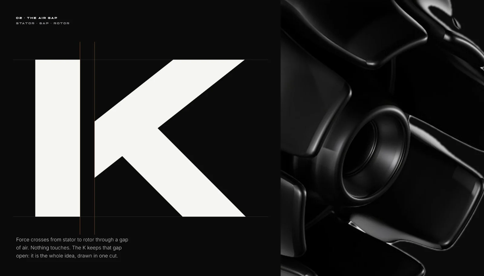
An inductor is a coil of copper that stores energy in a magnetic field. In an induction motor, force crosses from stator to rotor through a gap of air — nothing touches, and yet everything moves. So we cut the K the same way: its arms set free from the stem by exactly that gap. The R answers it at the end of the name.
The gap is drawn by the ground showing through — never by a line, a stroke or a second colour.
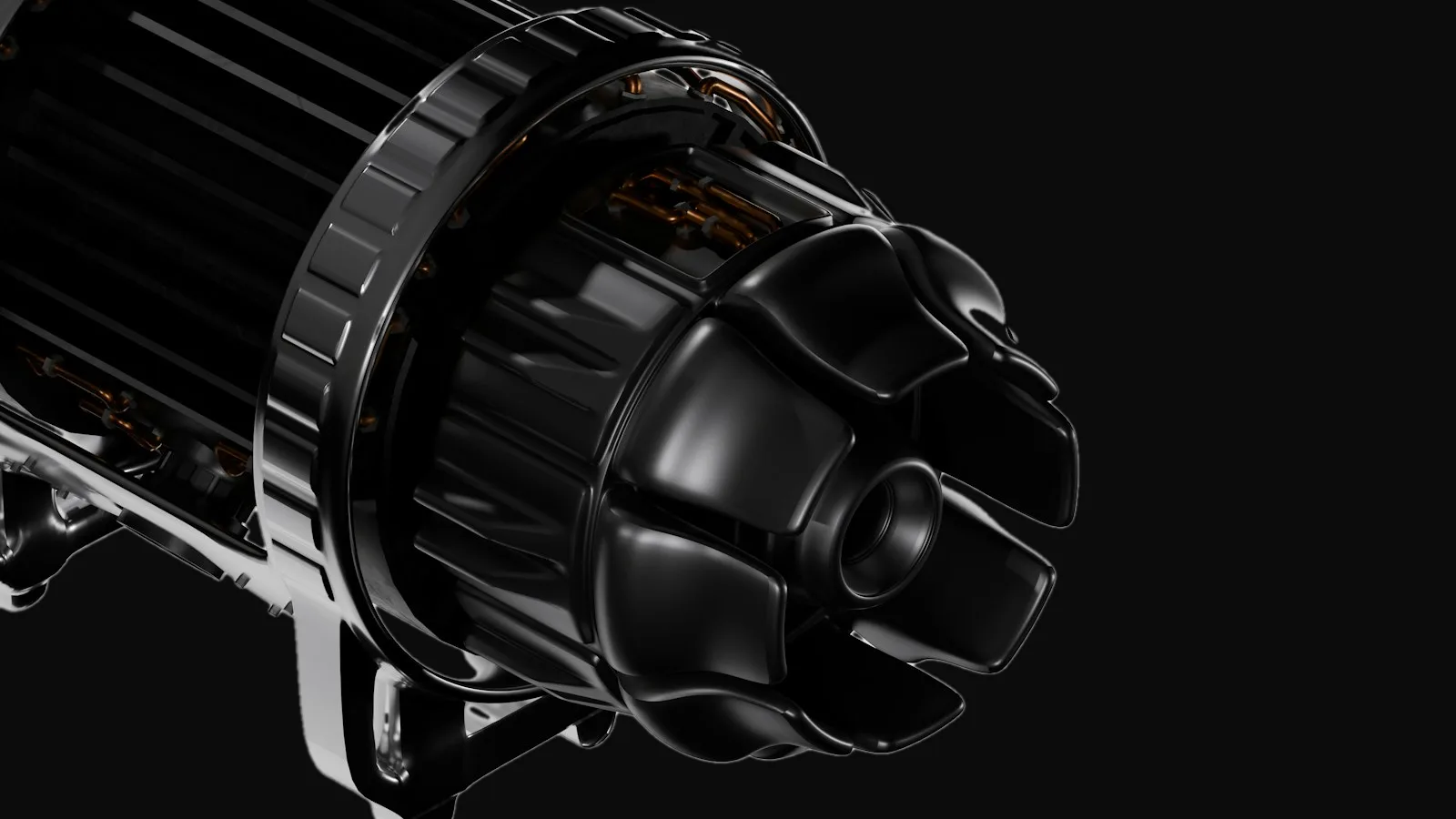
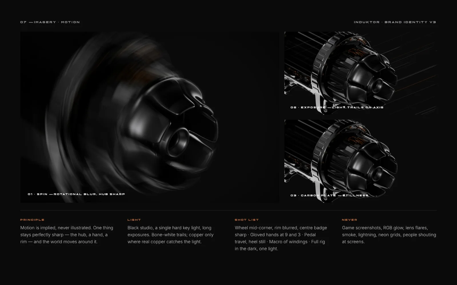
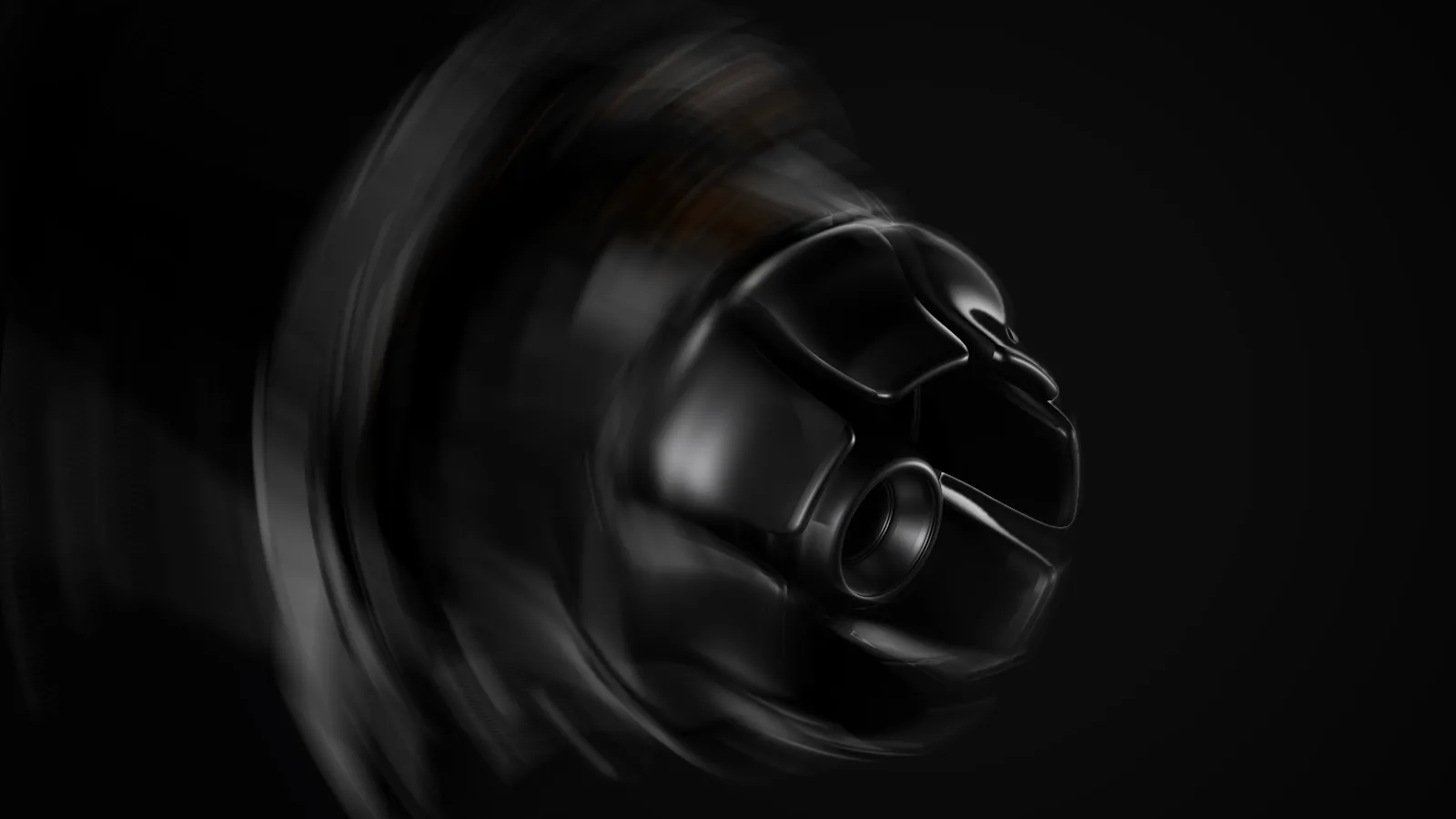
Motion is implied, never illustrated.
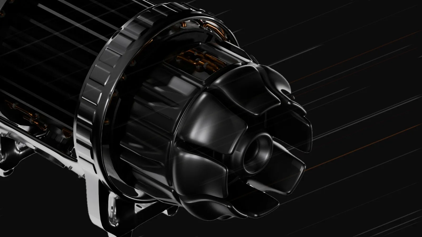
One thing stays perfectly sharp — the hub, a hand, a rim — and the world moves around it. A black studio, a single hard key light, long exposures; copper only where real copper catches the light.
- 01Spin — rotational blur, hub sharp
- 02Exposure — light trails on the axis
- 03Carbon plate — stillness
Glass reveals. It never decorates.
The page is dimmed glass. The window you choose shows the product at full clarity — on the site it follows the cursor; on the wheel’s display it follows the torque.
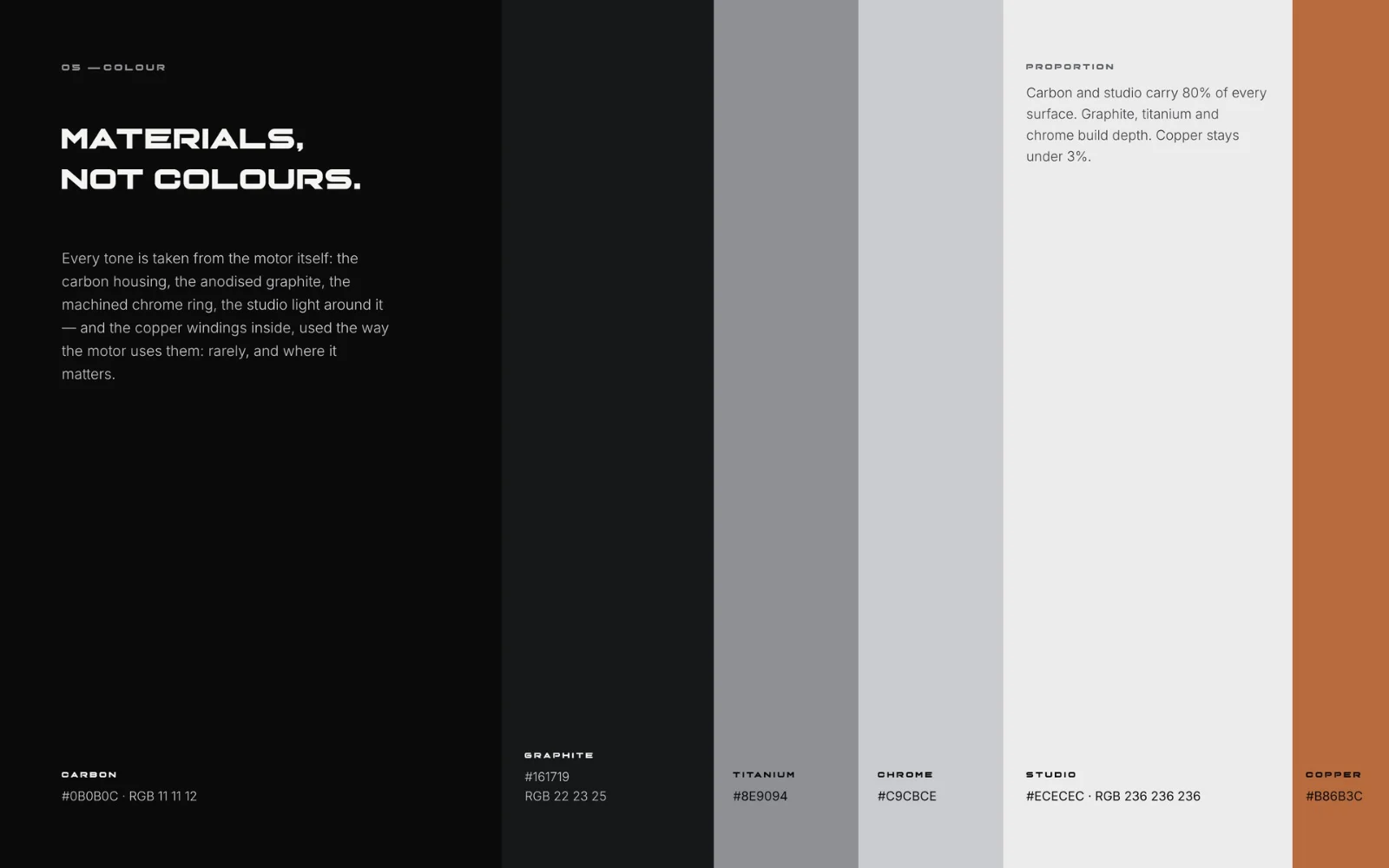
Materials, not colours.
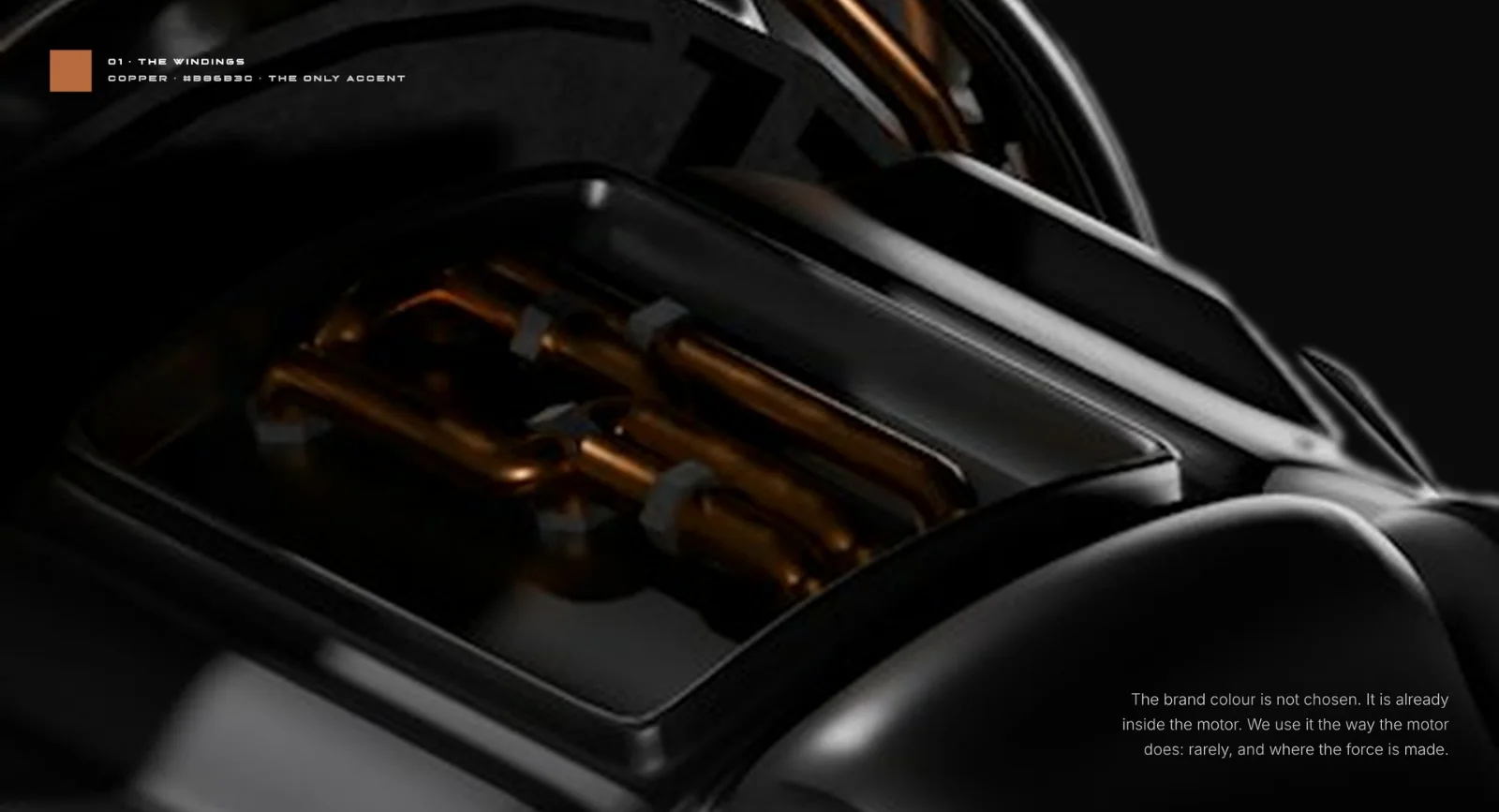
Every tone is taken from the motor itself — the carbon housing, the anodised graphite, the machined chrome ring, the studio light around it — and the copper windings inside, used the way the motor uses them: rarely, and where it matters.
- Carbon#0B0B0C
- Graphite#161719
- Titanium#8E9094
- Chrome#C9CBCE
- Studio#ECECEC
- Copper#B86B3C
Drawn to proportion: carbon and studio carry 80% of every surface, graphite, titanium and chrome build depth, copper stays under 3%.
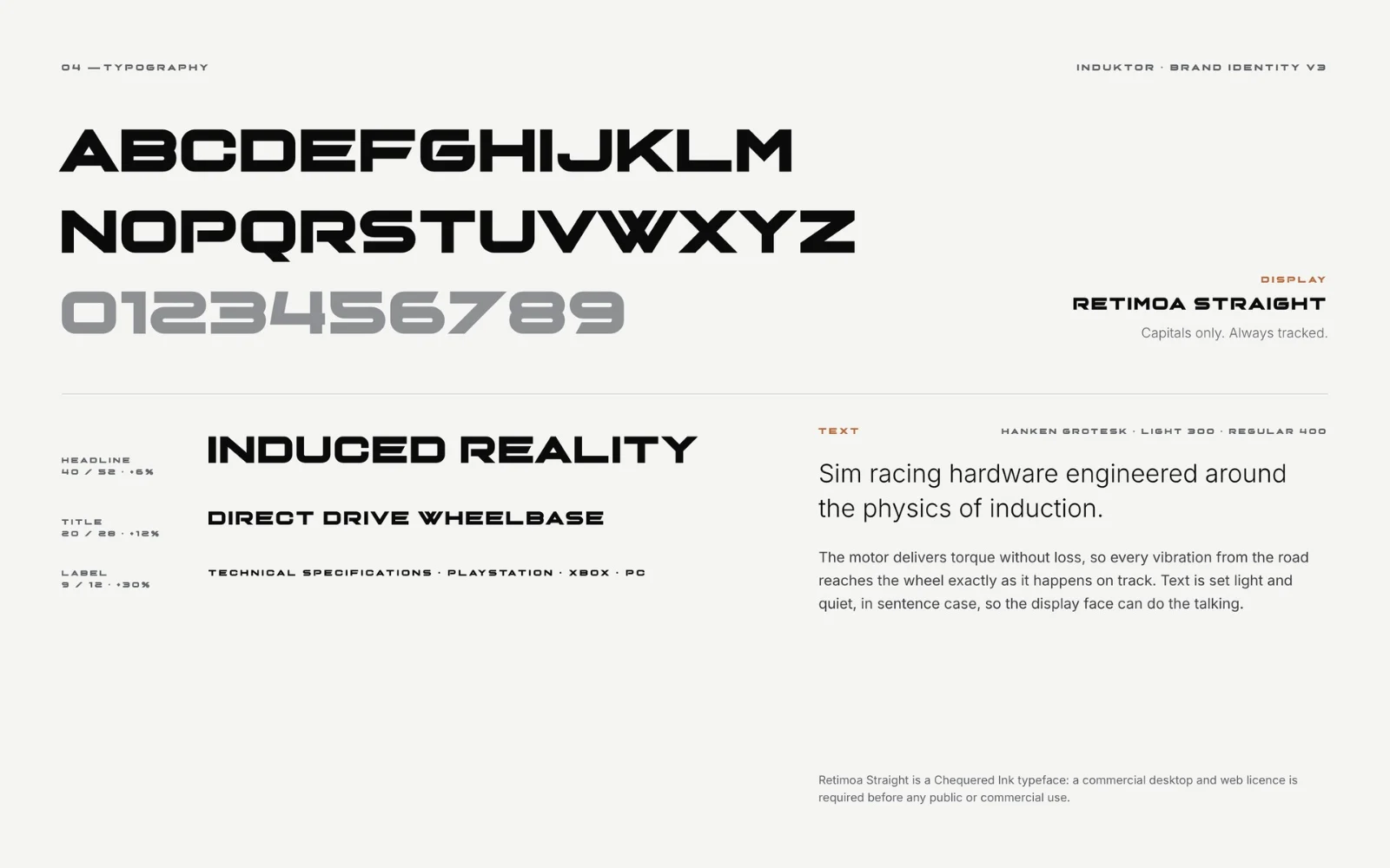
- Retimoa Straight Display · capitals, always tracked
- Hanken Grotesk Text · light, sentence case
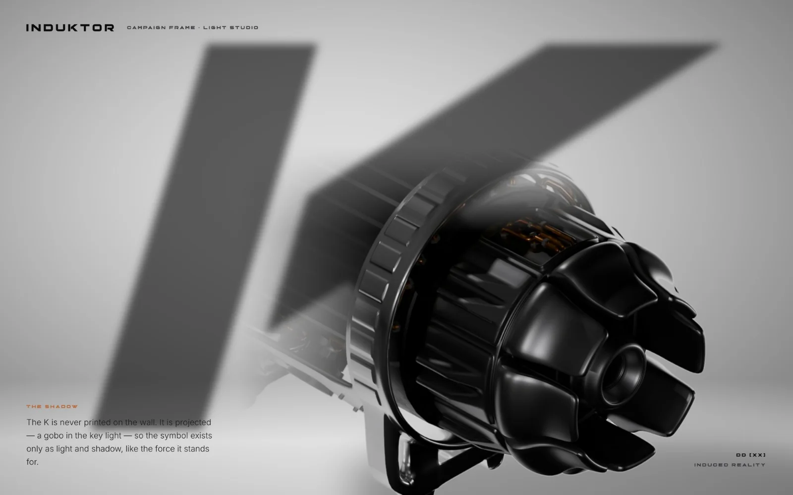
The K is never printed. It is projected.
A gobo in the key light: the symbol exists only as light and shadow — like the force it stands for.
 Logo system
Frame by frame.